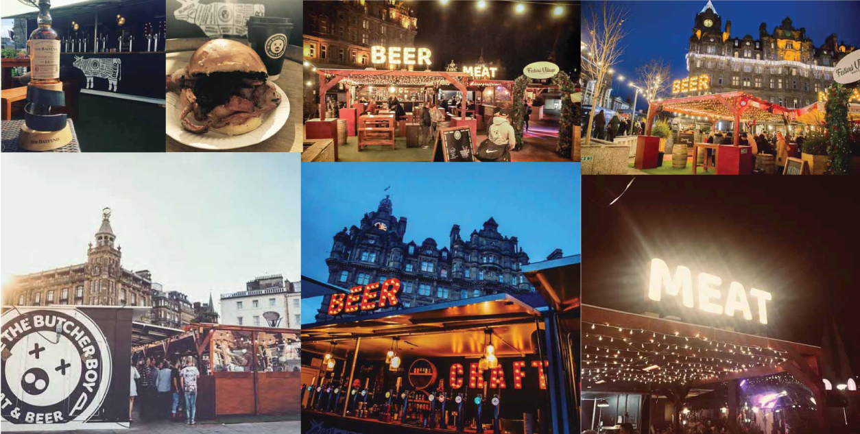
Brief: Create a pop-up space for a beer and burger bar. The challenge was to incorporate two large bars and grill bar.
Strategy: The Butcher Boy is relatively new to the street food scene. The space needed to look inviting but have an edgy and unfinished character in keeping with the brand. The Butcher Boy sells meat and beer…we wanted to focus only on those elements to keep the
message clear and draw meat and beer lovers in.
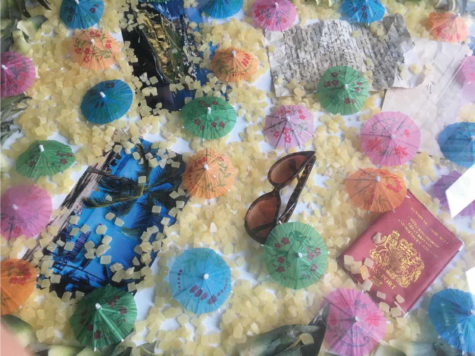
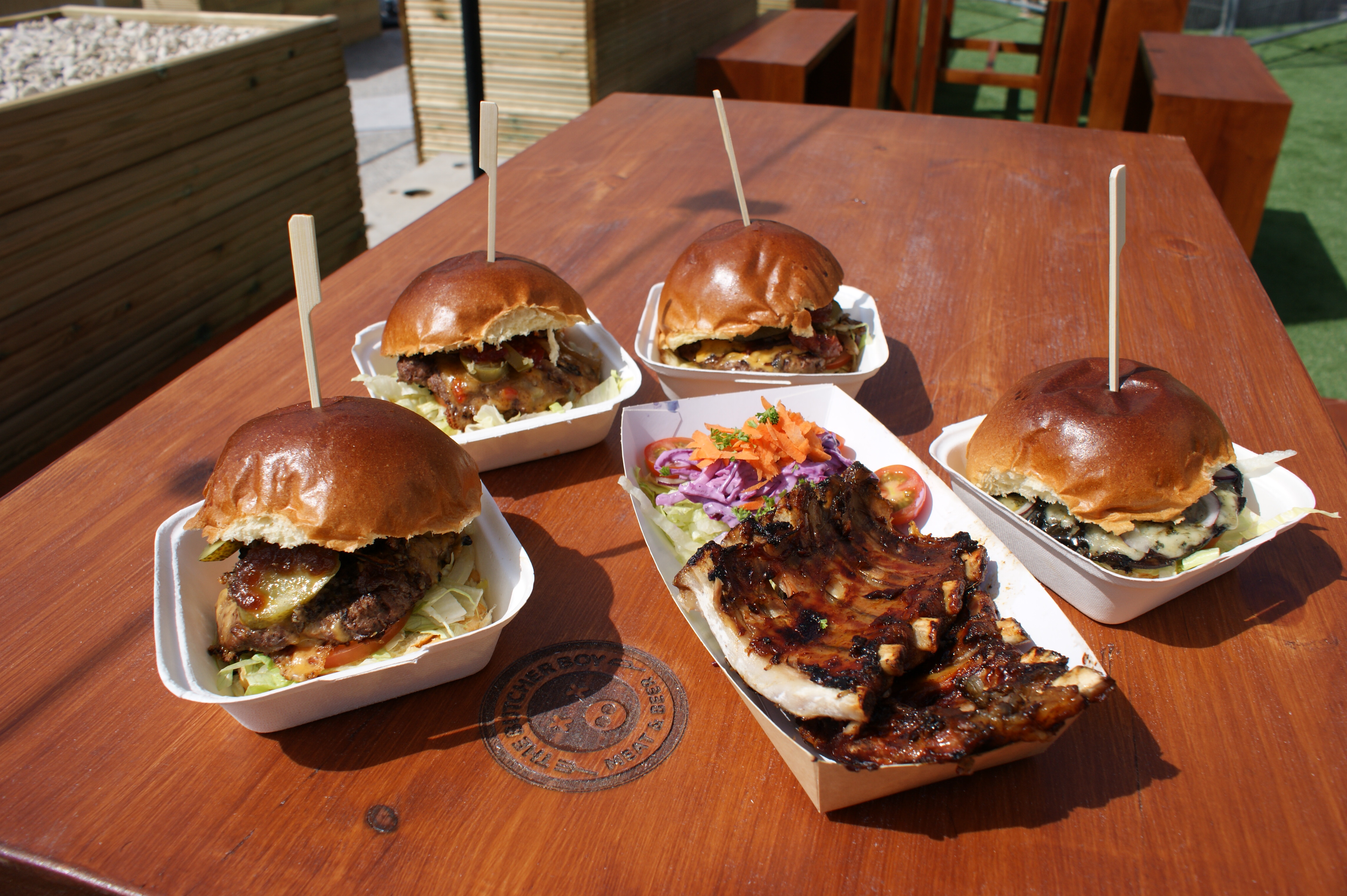
Result: The look and feel of The Butcher Boy is rustic, raw and on trend. We designed and created rusty carnival signs that simply stated they offered MEAT & BEER…and boy did they stand out! We wrapped the bars in a black matt vinyl to give them a slick but raw finish. The whole space was tied together with quirky POS including cups, parasols, menu boards and uniforms. The butchers lost count of how many burgers were devoured and how many beers enjoyed!
RELATED PROJECTS
ACCREDITATIONS


